NOVEMBER 17, 2022 - FEBRUARY 4, 2023
ON DISPLAY AT THE PABST VISITOR CENTER & GALLERY AT THE ATLANTIC CENTER FOR THE ARTS
LOCATED AT 1414 ART CENTER AVENUE, NEW SMYRNA BEACH
RECEPTION: THURSDAY, DECEMBER 1, 2022 FROM 5-7PM
Andrew Sovjani shares his vision through a series of still life compositions–elevating ordinary, everyday objects–which provide insight into his practice, function as commentary and deliver his complex aesthetic.
The title of his first series, Whitewashed, provides a valuable clue to his method, which involves painting over each cover to enforce a sense of uniformity. Whitewashing was traditionally applied to exteriors as a means of preservation. Sovjani employs the technique of whitewashing for a specific purpose–to obscure identifying titles and allow the viewer’s attention “time to absorb the books physicality.” By removing these distractions, he reveals the individual character of each book. Slightly worn edges of cloth. Warped pages. Variations of texture and volume.
These details stand out in abundance, enhanced by his thought-provoking arrangements and use of contrast.
© Andrew Sovjani | Construct #1, 2018
© Andrew Sovjani | Construct #2, 2018
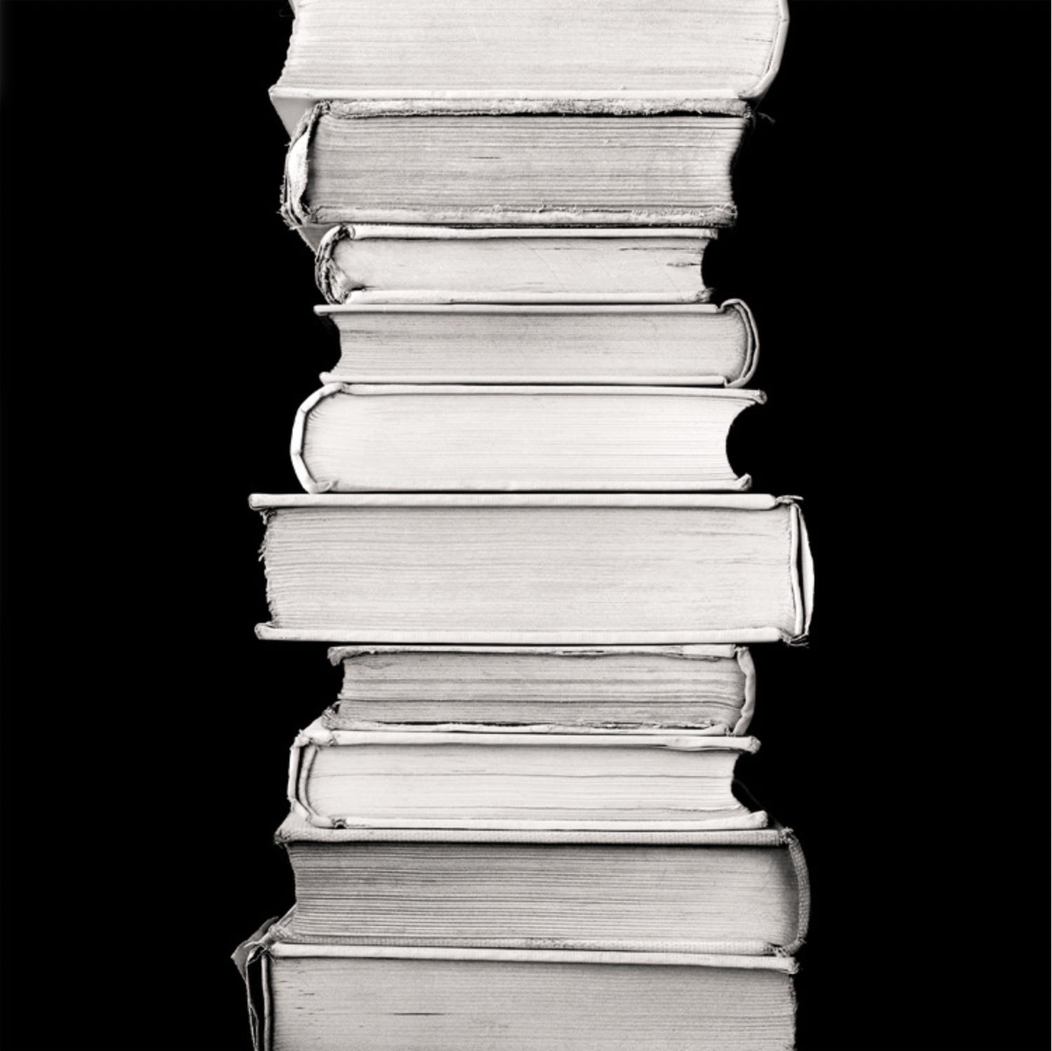
At first glance, the books in Construct #1 (2018) appear to levitate, defying gravity and their own weight. A skillful use of camera angle (positioned from above) allows for this illusion; the final image (rotated 90°) is presented as if the books were stacked on their sides. Construct #2 (2018) offers a foreshortened or close up view of two stacks of books, edges misaligned to great effect. The unique shape formed by their encroaching spines gives the impression of a crooked row of teeth, adding another layer of visual interest. In Construct #3 (2018) a vertical column of books holds the viewer’s attention squarely in the center of the frame. Deliberately stacked to offset one another, their edges are of immediate note. Highlighted against the dark background, their collective outline appears as reoccurring, crescent-shaped paper moons amid a night sky.
Sovjani’s unique photographs not only invite interpretation, but encourage participation by stimulating the viewer’s imagination.
© Andrew Sovjani | Construct #3, 2018
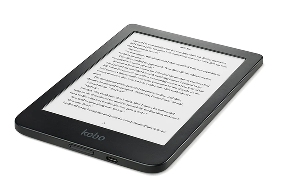
Standard eReader
In the digital era, text is illuminated on a flat screen; a swipe or a scroll allows new information to be presented, leading to a homogenous–and less kinesthetic–interaction.
“By concentrating on seemingly mundane objects, such as books and paper, Sovjani
forces us to re-examine our relationship to them, altering their significance and our
understanding in the process.”
FORM & FUNCTION
In the same way that we began to understand the importance of the physical touch during quarantine–there’s no substitute for the type of true connectivity that comes with being together–Sovjani’s work addresses the whole tactile ‘experience’ of a physical book. His approach is designed to emphasize its physical properties, sentimentalizing the book and its objecthood.
“Physical books are the poster-child for things that are on the verge of disappearing as we adopt more digital devices. The consequence of this choice is that we are unwittingly losing many full, multi-sensory experiences. ”
Unlike digital devices, we attribute human characteristics to books. Consider a book’s anatomy–namely its spine–which is the connection point where the pages are gathered and bound. It is surrounded on both sides by “joints.” When in our hands, we experience the sensation of holding and balancing its weight; feeling an embossed cover, thumbing through the pages, detecting faint whiffs of lignin–all of this appeals to our senses.
Books are firmly imbedded in our popular culture as well as our lexicon. The standard caveat “not to judge a book by its cover” is universally known. When giving advice, a common phrase is to “take a page from my book,” which means learning from another’s mistakes. When considering the difference between the format of an eReader and a physical book: one cannot exclaim “It’s a real page turner” in the absence of actual pages. When sharing a plot summary, we often refer to “the heart of the story,” literally imbuing it with life. Sovjani's work taps into our cultural consciousness, playing off our sense of familiarity and comfort, yet challenging our perception at the same time.
In his newer works, Sovjani introduces color to each scene–sparingly in some cases, and boldly in others.
© Andrew Sovjani | Homage to W.T., 2022
Of particular interest is Homage to W.T. (2022) in which he pays tribute to Wayne Thiebaud, an artist known for his persistence in seeking out the details of a composition: exploring the arrangement of objects, balancing color and pattern, and emphasizing quality of light. Thiebaud’s still lifes–typically of commonplace objects–were rendered completely from visual memory and his imagination. His works were layered, making use of simple, yet stylized shapes, and often as complex as his subject matter was straightforward. Sovjani mimics Thiebaud’s painterly approach, adding a highly textured background, cool shadows accentuated with warm highlights, and varying his arrangement of the books to form a pattern of triangles.
Moving beyond a sculptural exploration of line and form in his early works, Sovjani's more stylized imagery recalls classic architecture. His constructs gradually become more complex in nature, forming columns, rectangular windows, entablature. Splayed pages become adornments, half-opened books issue layered invitations, and specific colors have been chosen with great care.
© Andrew Sovjani | Color Construct #2, 2021
© Andrew Sovjani | Rorschach’s Reality, 2022
Notably, individual characteristics and details become more pronounced: folded pages reveal text and numbers, stamped checkout cards attest to use (or the lack thereof), geometric elements are continually reinforced and concentric circles added. A mix of warm and cool colors simultaneously allows aspects to advance or recede, while the placement of these books become increasingly paramount to our understanding of the scene.
In Rorschach’s Reality (2022), Sovjani presents one of his most complex images yet, adding to the layering effect with multiple backgrounds, color swatches and geometric shapes. He also includes illustrations from the page of a dictionary, and visual clues in the form of the selectively placed words, “fact” and “fiction.”
Of all his architectural constructs, this represents one of the least abstract: the majority of the books on display form a solid square, with another in the center that allows the viewer to look through, similar to a window. Overall, one is left with the impression of viewing a “home” complete with a chimney stack from which multi-colored cards emanate. Metaphors abound, though the artist allows the viewer to conjecture and form their own opinion. Like the Rorschach test, perhaps we see what we want to see. At the very least, Sovjani’s work prompts introspection, and should leave the viewer examining their own relationship with books.
ALSO ON DISPLAY
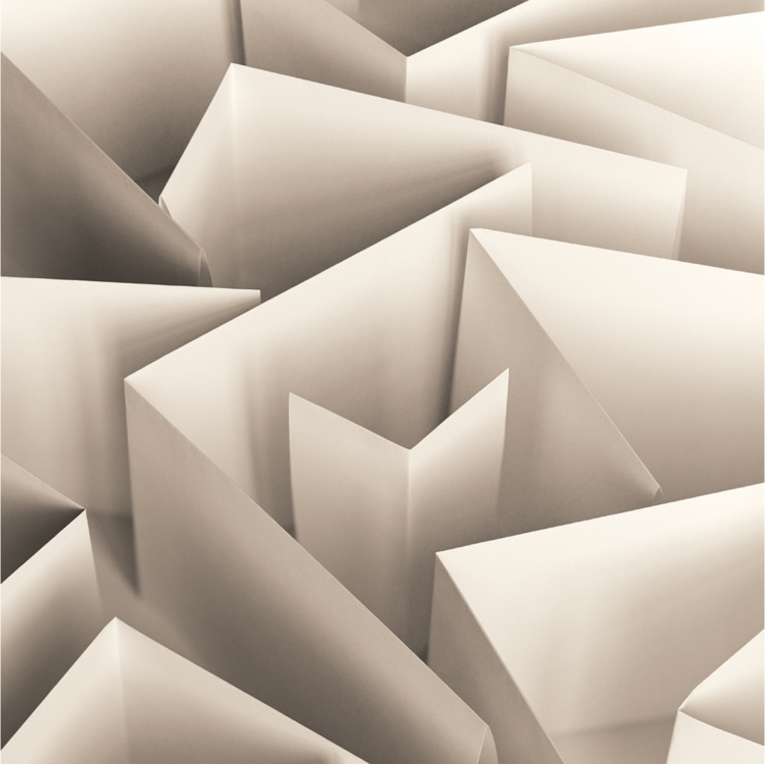
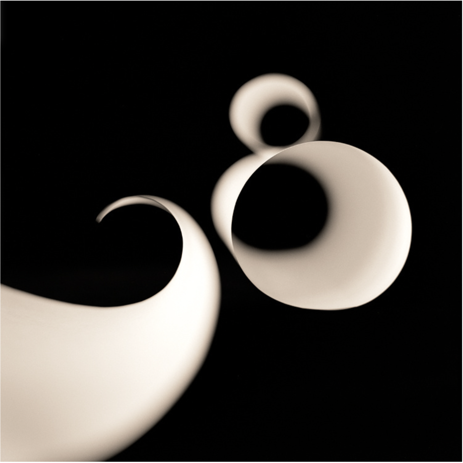
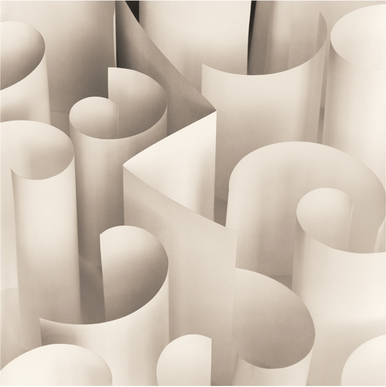
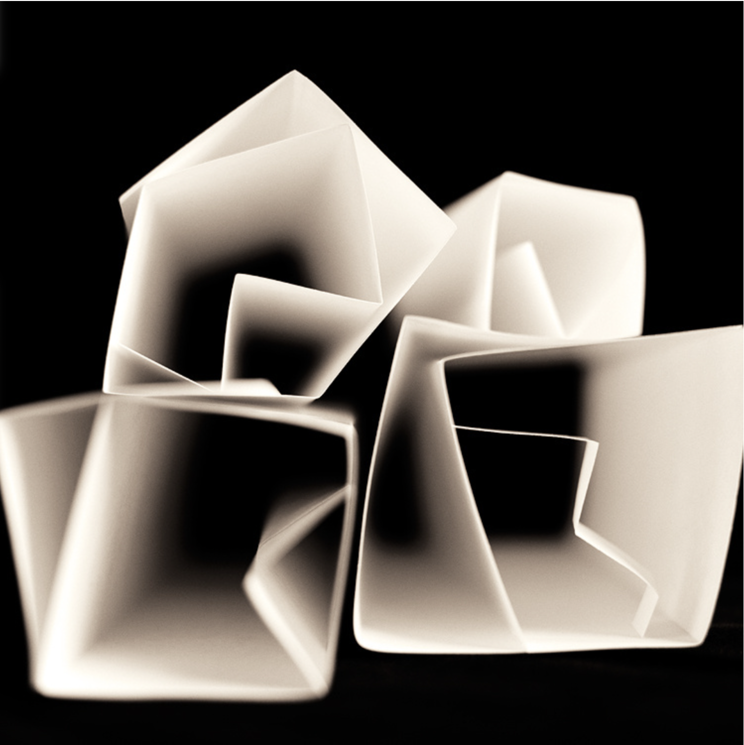
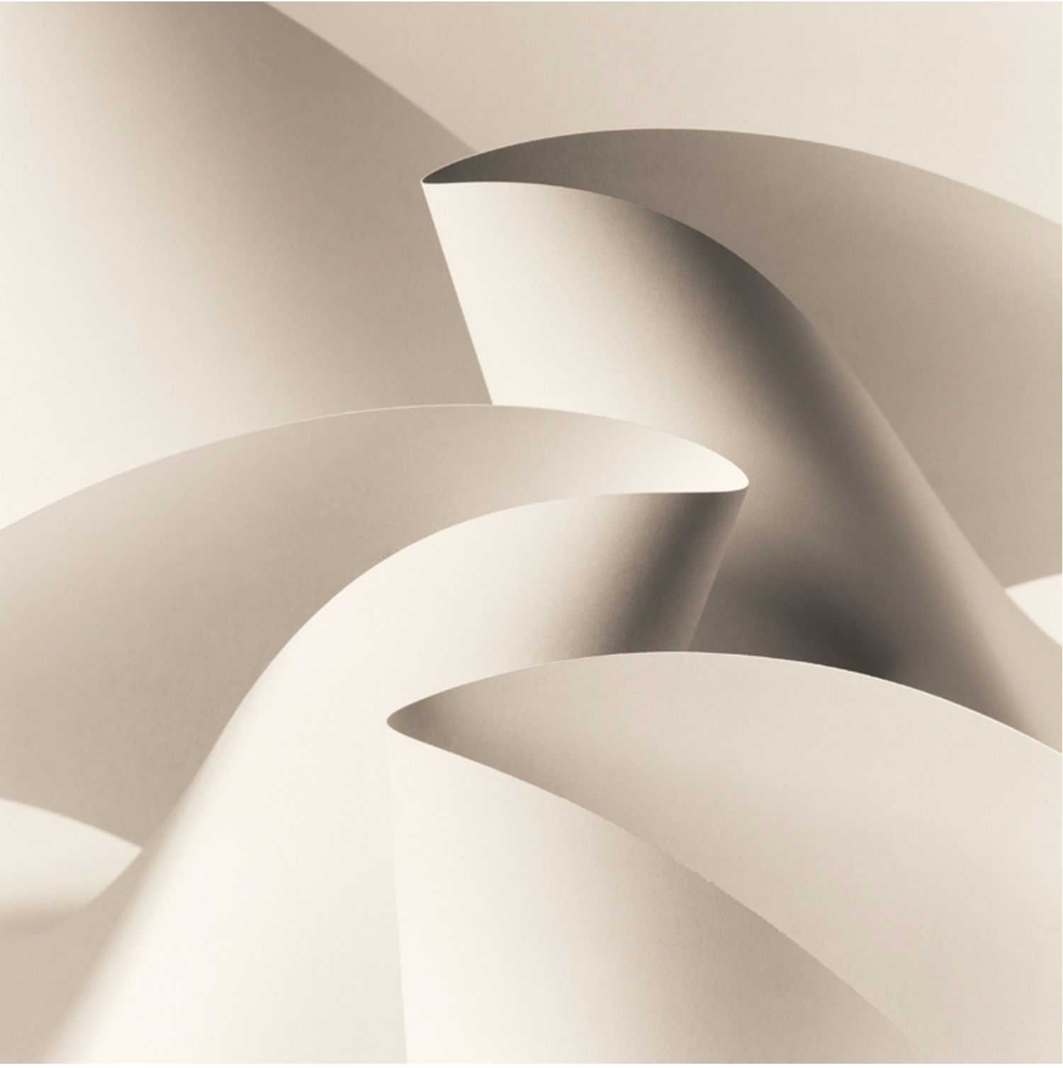
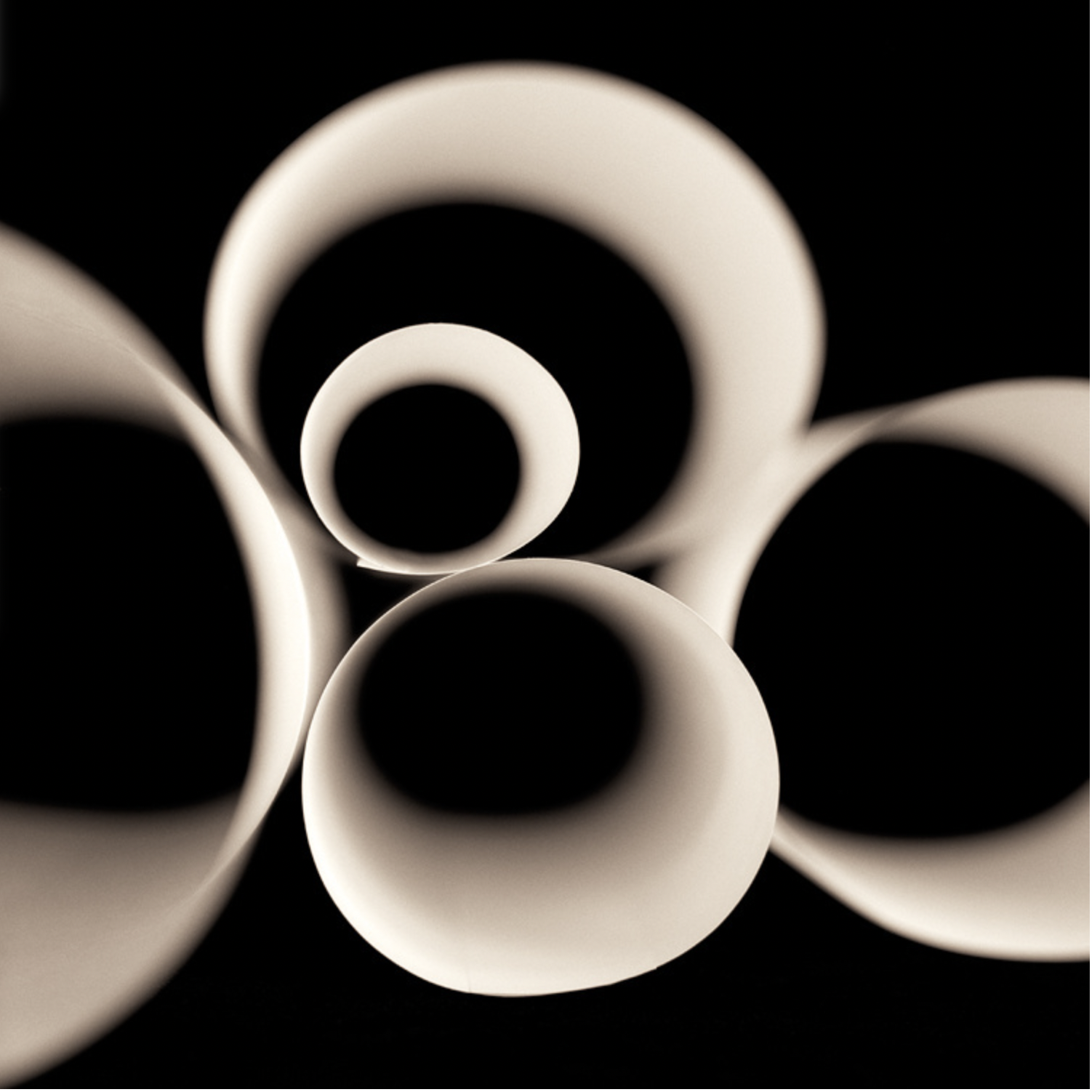
Andrew Sovjani’s Paper White series presents the viewer with equally engaging compositions.
His method of arrangement bears a striking similarity to the way in which one would set moveable type–letter by letter, word by word, page by page.
From left to right, top row: PW #36, 2006, PB #5, 2008, PB #38, 2007
From left to right, bottom row: PW #3, 2005, PM #6, 2007, PB #4, 2007
All images © Andrew Sovjani
“Having lived in Japan many years, I find myself attracted to a serene yet subtly complex aesthetic with an appreciation for the beauty that surrounds us everyday. For me, photography has always been about the study of light and its nuances. Its qualities are always changing, as we move from daybreak to sunset, pass through the seasons or as we travel to different parts of the world. I wanted to find a subject that would allow me to study light directly without the subject matter “getting in the way”. I chose plain, ubiquitous white paper as my subject.
I knew that when surfaces receive light, the light effects vary depending on the angle of exposure. I started to fold, curl and alter the paper and observe these forms under different lighting conditions. I began to play with arranging the folds and curls into groupings until relationships began to form between their lines, shapes and shadows. At some magical point, the elements of the composition and the quality of light come together to transform the subject into something more than paper. This is when the shutter is released.”
These remarkable images possess detail, utilize positive/negative space and exploit a delicate tension between the sharply folded paper and the gently curled/cascading paper. His deliberate use of soft or stark lighting adds to the illusion. While not wholly abstract, one can easily conjure an array of interpretations from each. Some appear to float in space while others are more grounded, creating a labyrinthine effect.
All images on display are courtesy of the artist.


